Optima
Appearance
 | |
| Category | Sans-serif |
|---|---|
| Classification | Humanist |
| Designer(s) | Hermann Zapf |
| Foundry | Stempel Linotype |
| Date made available | 1958 |
| Variations | Optima Nova |
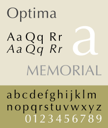
Optima is a sans serif typeface. It was designed by Hermann Zapf. Some of the lines are a little wider at the ends, which looks a little like serifs but is not.
Optima was inspired by classical Roman capital letters and the stone-carving of Renaissance period tombstones Zapf saw in Florence, Italy in 1950 on a holiday.[1]
Zapf intended Optima to be a typeface that could be used for both body text and for titles. Zapf used only this typeface in his book About Alphabets.[2]
The first release of Optima is the one used the most. Like many sans serif fonts, it has an oblique style instead of an italic.[3] In Optima nova, a later release, this is replaced by a true italic.
References
[change | change source]- ↑ "Optima Font" (PDF). Monotype Imaging. Retrieved February 21, 2019.
- ↑ "About More Alphabets". Shaw, Paul. Retrieved February 21, 2019.
- ↑ An oblique style has the letter forms slanting, whereas a true italic is a completely different style from the normal medium typeface.
